Overview
Amazon’s delivery app was built for simple addresses in simple places. As the network scaled globally, drivers were working around its limitations—ignoring native maps, manually handing off packages mid-shift, and losing time to routing logic that couldn’t see a condo building as one stop.
I spent a year rebuilding the delivery experience around how drivers actually work: stops grouped by what a driver can carry in one trip, an itinerary a driver can orient to at a glance, and a drawer that adapts to whether they want the map or the list.
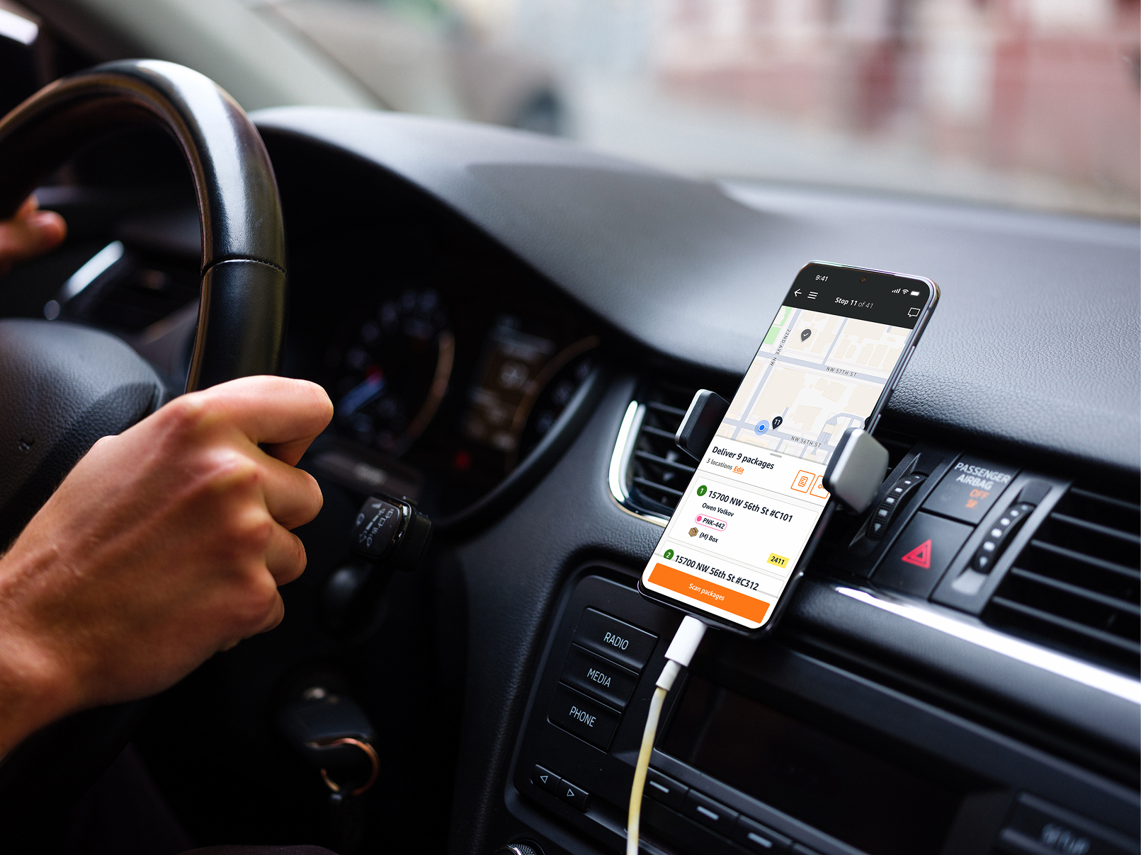
Fig 1.0 - The app in its real context: dash-mounted, glanced at between stops, read in a second or not at all.
What 20 ridealongs turned up
I partnered with our UX Researcher on 20 ridealongs across Seattle and London. Drivers bounced constantly between the itinerary and individual stops—often losing track of which stop they were on, sometimes writing addresses down on paper to keep their place. Route-level context and stop-level detail lived in two different mental models, and the app made you rebuild the connection every time you looked down.
So the real problem wasn’t only grouping locations. It was visual hierarchy: at a glance, from a dash mount, a driver needed to know where they were, what was left, and what this stop asked of them—without reading a single label twice.
Hierarchy at every level
A stop is one park-and-walk: every location a driver can reach on foot, arms full, without going back to the van. Sometimes that’s three doors in one condo building; sometimes it’s a couple of houses across the street from it. So the itinerary counts the stop once and the stop detail opens up to show its parts. The same hierarchy repeats at every level: route, stop, location, package.
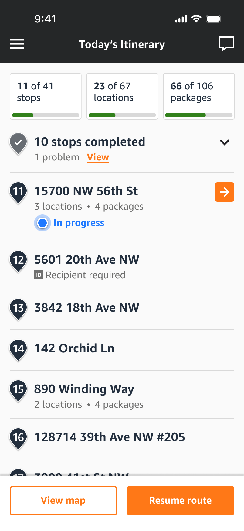
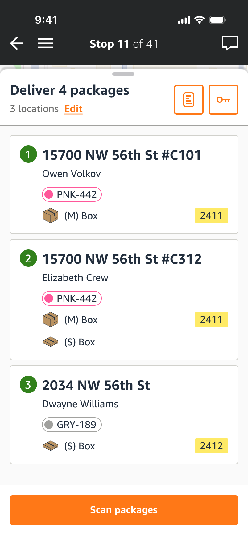
Fig 2.0 - Route, stop, location. The drawer adapts to each driver’s preference—map-focused, split, or full list.
An anchor you don’t have to look for
The in-progress stop is the only thing on the itinerary carrying a live blue state; everything completed collapses into a single line. A driver glancing down finds their place before they finish the glance.
Grouped stops, honest counts
Routing treated every delivery address as its own stop, so a day that was really 41 park-and-walks read as 67 destinations. Grouping by what a driver could carry in one trip let the counters tell the truth at three grains at once—stops, locations, packages—and drivers stopped hand-tallying what was left.
Parts that come out of the whole
Locations animate out of the stop rather than replacing it, so the relationship between the trip and its doors is seen rather than learned. Drawer conventions—shadow hinting at content beneath, a handle signalling interactivity—stay identical across every view.
The app had to stay accessible, and package labelling had to be free to change for years after I left. With screen space at a premium, the pressure was to lean on iconography.
I argued the other way: coloured badges plus text labels, never colour alone, and vertical real estate spent on an expanding drawer to carry the hierarchy. Fewer glyphs to memorise, no colour-blind failure mode, and room for package types nobody had invented yet.
Custom package illustrations
To let drivers identify a package by size at a glance, I drew a set of tiny icons—envelope, small box, medium box—at the size they’d actually be read, and wrote illustration guidelines so the set could scale to package types that didn’t exist yet.



Fig 3.0 - Drawn for 20px, shown here at 64. Each pairs with a text label in the drawer, so the icon speeds recognition while the label carries the meaning.
The U-Lab, and shipping in test order
Ten minutes beats ten permits
Our researcher proposed a simulated delivery lab in the parking garage—permits, build-out, months of setup. I pushed for something we could run that week: invite drivers already delivering to nearby Amazon buildings up for a 10-minute session. The first one drew 15 drivers. I formalised it into a weekly “U-Lab,” which stayed a fixture of the Last Mile team long after I left.
Released in the order we tested it
Rather than launch everything at once, we shipped in the same sequence the U-Lab had validated: new card style first, then the list view changes, then grouped stops. Each release landed on a habit drivers had already been taught by the one before it, and regressions had somewhere obvious to point.
“[That’s] so cool how the locations split out from the stop like that. I get it.”
— Rahul, DSP driver, U-Lab participant