Overview
DTN had been the backbone of agricultural data for 95% of U.S. farms for decades, delivered through a proprietary satellite box bolted to the wall of the barn. As the industry moved online, the web presence lagged behind the hardware it was supposed to replace.
The Nerdery was brought in to rebuild the platform as a mobile-responsive experience. The hard part was not the layout. It was moving half a million traditionalist producers off hardware they trusted, without alienating a younger generation who had never touched the satellite unit at all.
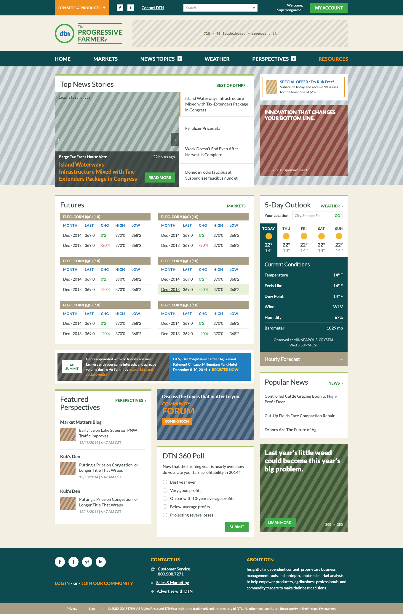

Fig 1.0 - The public homepage at both ends of the responsive range, recreated from the original design files. Click either to see the full page.
Two mental models in one product
I ran onsite contextual inquiry and more than 80 interviews with producers. What came back was not one audience with a range of tech comfort. It was two genuinely different ideas of where farm data lives.
Rugged, reliable, always in the same place. Older producers described it as a tool, not software. They knew where every number sat on the screen and had stopped reading the labels years ago.
The command center. Younger producers expected the farm to be legible from the cab of a combine, and judged the product against every other app on the phone rather than against the box in the barn.
“I just think of the farmers around here that are crop only, they have nothing to do but wax their combine. I can see them sitting and reading this all day.”
Designing for the midpoint would have served neither. So I did two things at once: laid the customizable dashboard out in the information hierarchy of the satellite units, so muscle memory carried over and the migration felt like a familiar screen rather than a new product, then leaned the rest of the experience into what the box could never do. Real-time GPS weather alerts. Market updates on the combine. A site that worked at whatever size the producer happened to be holding.
Moving 500,000 users without losing them
A migration this size fails on the small stuff: a section that no longer exists, a login that suddenly asks for more, a familiar module that moved. So the content map came before the layouts. Every legacy topic bucket was mapped to the new hierarchy by name, using the words producers already used, and every page was assembled from the same fixed module set, so nothing a subscriber relied on could quietly disappear in the rebuild.
Fig 2.0 - The content map: six primary sections, each composed from a fixed module set. Every legacy bucket had a named destination before a single page was designed.
Free, premium, and the argument in between
Two products, one brand family
Public and premium needed separate names, separate URLs, and distinct visual aesthetics, while still reading as obviously the same company. Hard paywalls guarded the genuinely proprietary content; news, blogs, and columns got a soft paywall, so a curious producer could read five pieces a month before being asked for anything.
Ads as layout, not as debris
Three external ad placements per page was a fixed business requirement, and the sales team wanted more. Rather than fight it, I designed the slots into the grid as deliberate breaks between dense blocks of content, at sizes the layout system could rely on.
Not everyone should convert
The segmentation work turned up producers who were never going to buy premium and shouldn’t be pestered about it. For them the conversion goal was a newsletter, the forum, or the magazine, which kept the paid pitch aimed at the people it actually suited.
Conversion strategy was the biggest fight on the project. The cheap answer was static house ads for premium: build once, run everywhere.
I argued for “sneak peeks” instead: real premium content, chosen for that producer from their behavior and location, in place of a generic pitch.
It cost more to build, so I won the argument with usability testing rather than opinion. Clickthrough on the tailored peeks beat the static ads clearly enough to justify the spend, and conversion went up.
Designed for the barn, not the studio
Two decisions came straight out of the farm visits, and neither would have survived a purely desk-bound process.
A style guide for glare
Producers read this on a phone in open sun, often through a windshield. The design system committed to a high-contrast palette and type sized and weighted for outdoor legibility, with the market tables treated most aggressively because they’re what people check without stopping work.
Offline-first mapping
Rural coverage has holes and the map layers are enormous. I pushed for an offline-first approach so the data-heavy geospatial layers stayed responsive in a browser and kept working through dead zones, rather than failing at exactly the moment a producer is furthest from the house.
Familiar conventions, custom controls
The layer controls came from the same instinct. The old weather box had big physical buttons for radar, satellite, and the rest, and producers switched between them without looking. So instead of a floating menu of checkboxes, I designed a horizontal tray of oversized targets that collapses out of the way, pages through overflow layers, and opens sub-options inline. Homage, not nostalgia: the same gesture, on a touchscreen.
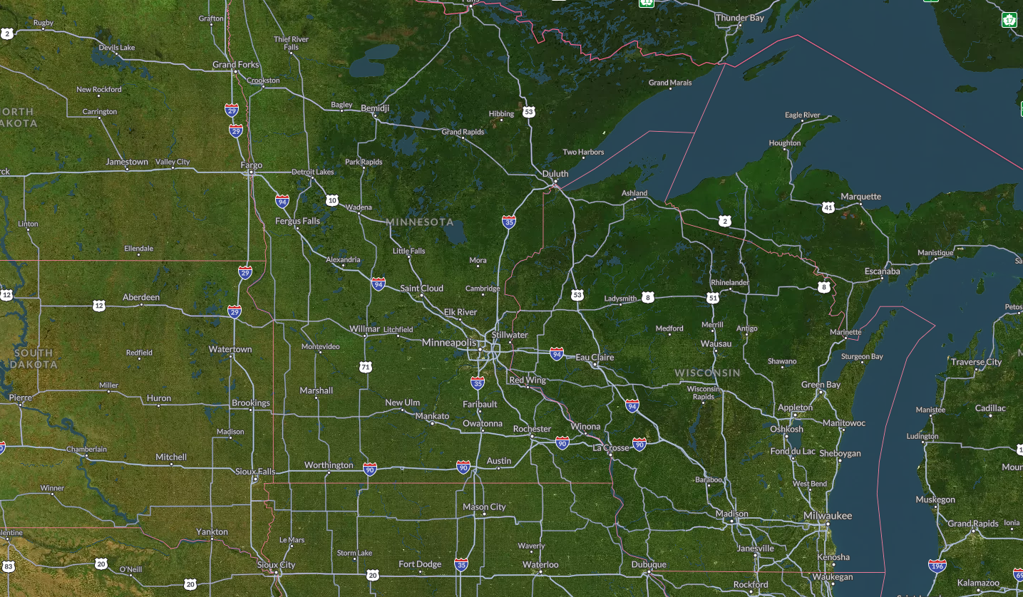
Fig 3.0 - Prototype of the layer tray. Click to show and hide layers, tap to select “Surface Analysis” to see a nested menu of options.
Microsites that still belong to the ecosystem
Sponsors and partners got their own spotlight sections, built by teams outside ours. To keep a sponsor page from reading as a different website, I wrote a microsite style guide that specified the whole anatomy: header and back-navigation, the sponsored-by treatment, the sub-nav for “inside this spotlight,” type and color values, form states, ad slots, and footer. Partners got room to sell; the producer never felt handed off.
Fig 4.0 - The microsite style guide, condensed. Enough constraint that a sponsor page couldn’t drift off-brand, enough room that partners could still sell.
Content strategy, and the CMS it needed
Every module on the site was fed by editorial staff, so we built a custom CMS for them: write the article, add the pictures, choose where it surfaced. But a CMS is only as good as the rules it enforces, and DTN had hundreds of content types split across a public tier, a community tier, and premium.
So before any of it was built, I worked through every content type in a governance spreadsheet: what an anonymous visitor sees, what a registered community member sees, what premium unlocks, which CTA belongs there, and how the CMS should classify it - free, metered, or hard paywall. That grid became the specification the CMS was built against, and the reason a soft paywall could be tuned later without redesigning a single page.
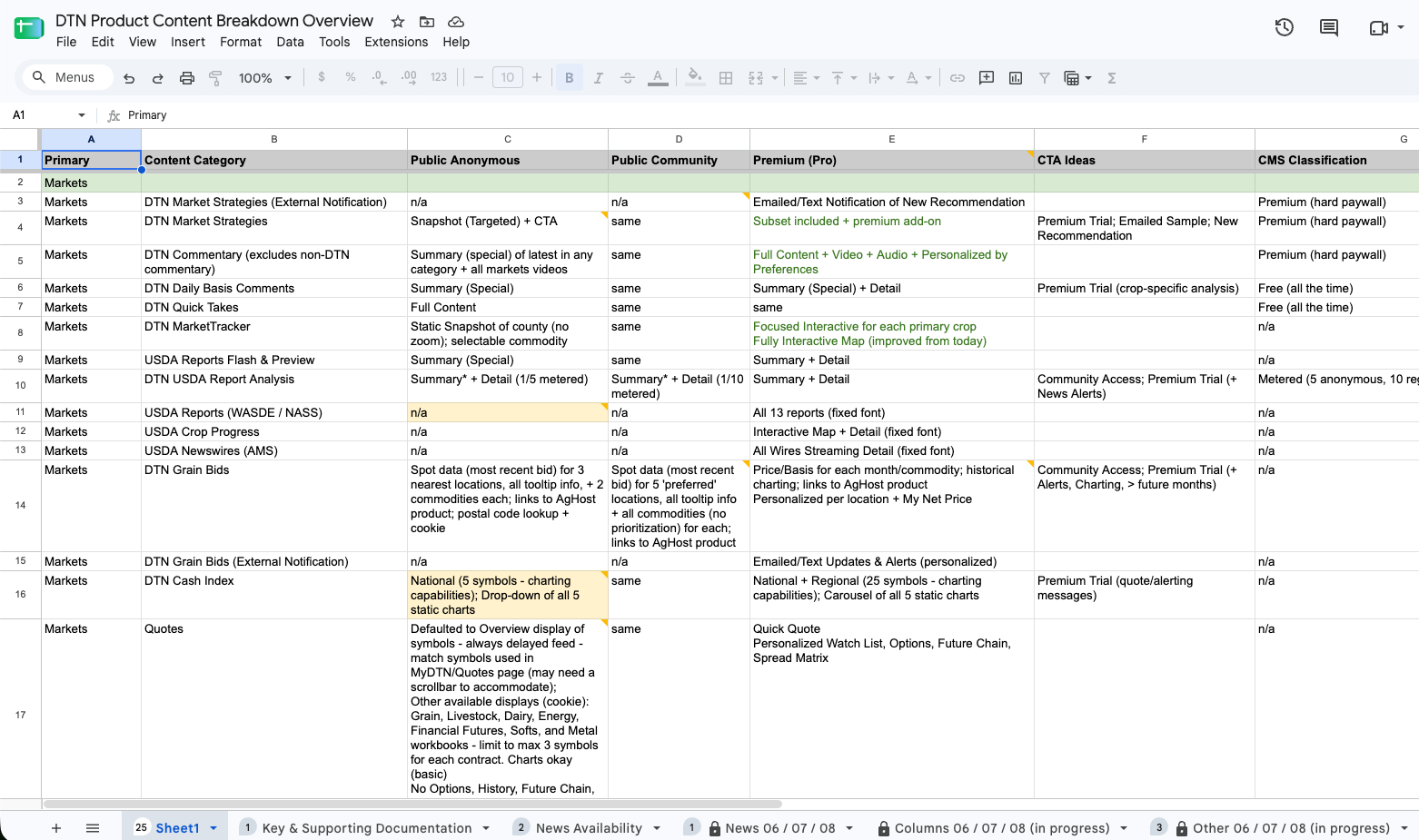
Fig 5.0 - The content breakdown: one row per content type, one column per tier, and a CMS classification for each. Unglamorous, and the single most useful artifact on the project.
“Design & functionality may be why you like a website, but CONTENT is why you return.”
— DTNPF Public Web Experience: Key Insights & Strategic UX Recommendations, January 2015