Overview
Love146 is an international human rights organization working to end child trafficking and exploitation. Having built a foundation in survivor care, they moved upstream into prevention with Not a #Number — a curriculum that teaches youth to recognize and resist exploitation, and one of the three most-used programs in its category. But the organization was sitting in a data desert: facilitators were teaching thousands of students on paper, and there was no scalable way to collect assessments, quantify impact, or produce the numbers grant funding depends on. Version 1.0 of the companion app couldn’t get them there. My back-end partner and I recommended a full rebuild, and I led the UX for 2.0 and built its front end.
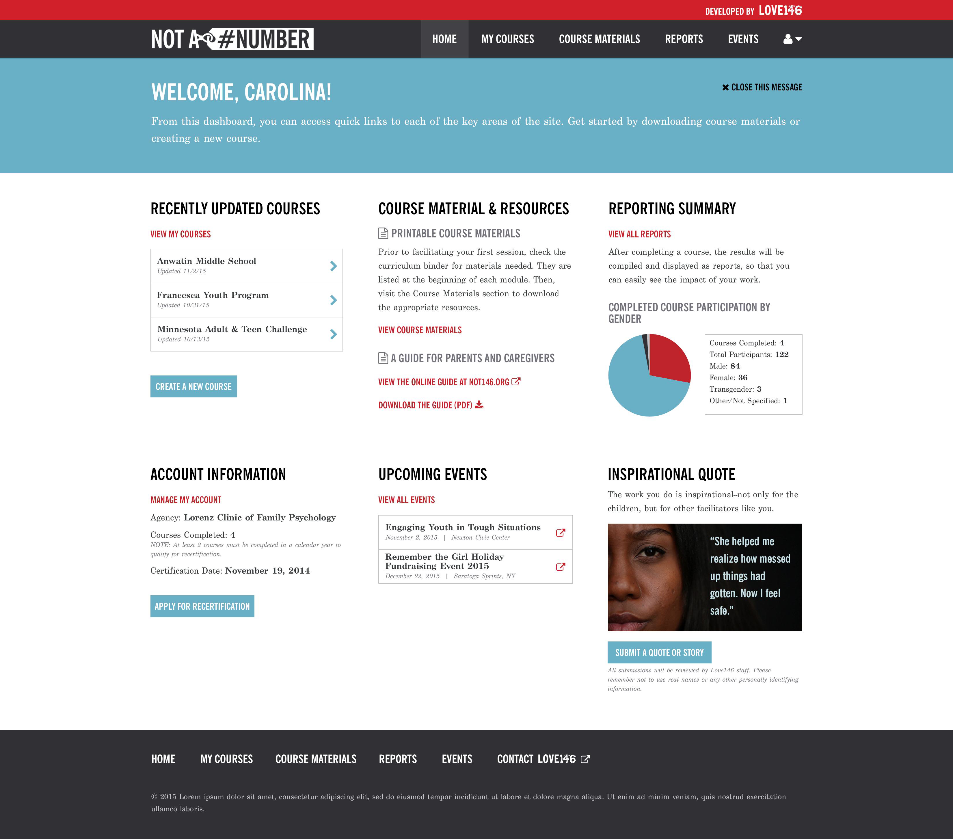
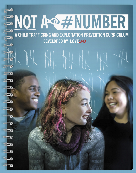
Fig 1.0 — The portal had to feel like an extension of the program, not an afterthought bolted onto it.
Why 2.0 had to be a rebuild
Recommending that a non-profit throw away working software is not a small ask, so the case had to be specific. We audited 1.0 and found the same story in three places: the constraints weren’t cosmetic, they were structural, and patching around them would cost more than starting over.
No dependable, ACID-compliant database. The framework supported only one datastore, so scalability and data integrity meant a rewrite — not a migration.
Off-the-shelf Bootstrap with none of the Love146 brand. Confusing navigation, inconsistent buttons and fields, and layouts that broke on the phones facilitators actually carried.
Reporting — the whole reason for the app — was never built, and the architecture made it prohibitively expensive to add. Nothing flexed for a curriculum taught out of order.
Four hours, six stakeholders, one shared problem
My partner and I flew to New Haven to run a four-hour workshop with the people who own the program: the US Programs Director, Executive Director for North America, Creative Director, prevention specialists and communications. Alignment mattered more than ideas — we needed the program history out of their heads, and one agreed sentence about what the app was for.
Instead of asking for features, I asked everyone to draw the problem: brainstorm on one side of the paper, then illustrate how the ideas relate on the back. Four themes surfaced, and they became the brief.
To reach the most children, the curriculum and app have to be the best in market — and visually of a piece with the program.
Facilitators already believe. Show them what their data does — and keep something human in the loop, like a shared story.
Entry is a tedious chore for busy teachers and social workers. Remove barriers, show progress, give the time back to the kids.
Surface trends for facilitators, agencies and admins — so Love146 can see where the curriculum should go next.
Mapping the journey found the constraint
We mapped every touchpoint across the three people the portal serves — Love146 admins, licensed agencies and their agents, and the facilitators in the room with the students — from first contact through certification, facilitation and reporting. Two things fell out of the map immediately: certification and re-certification are the spine of the whole system, and the most important stretch of the journey happens with the app closed.
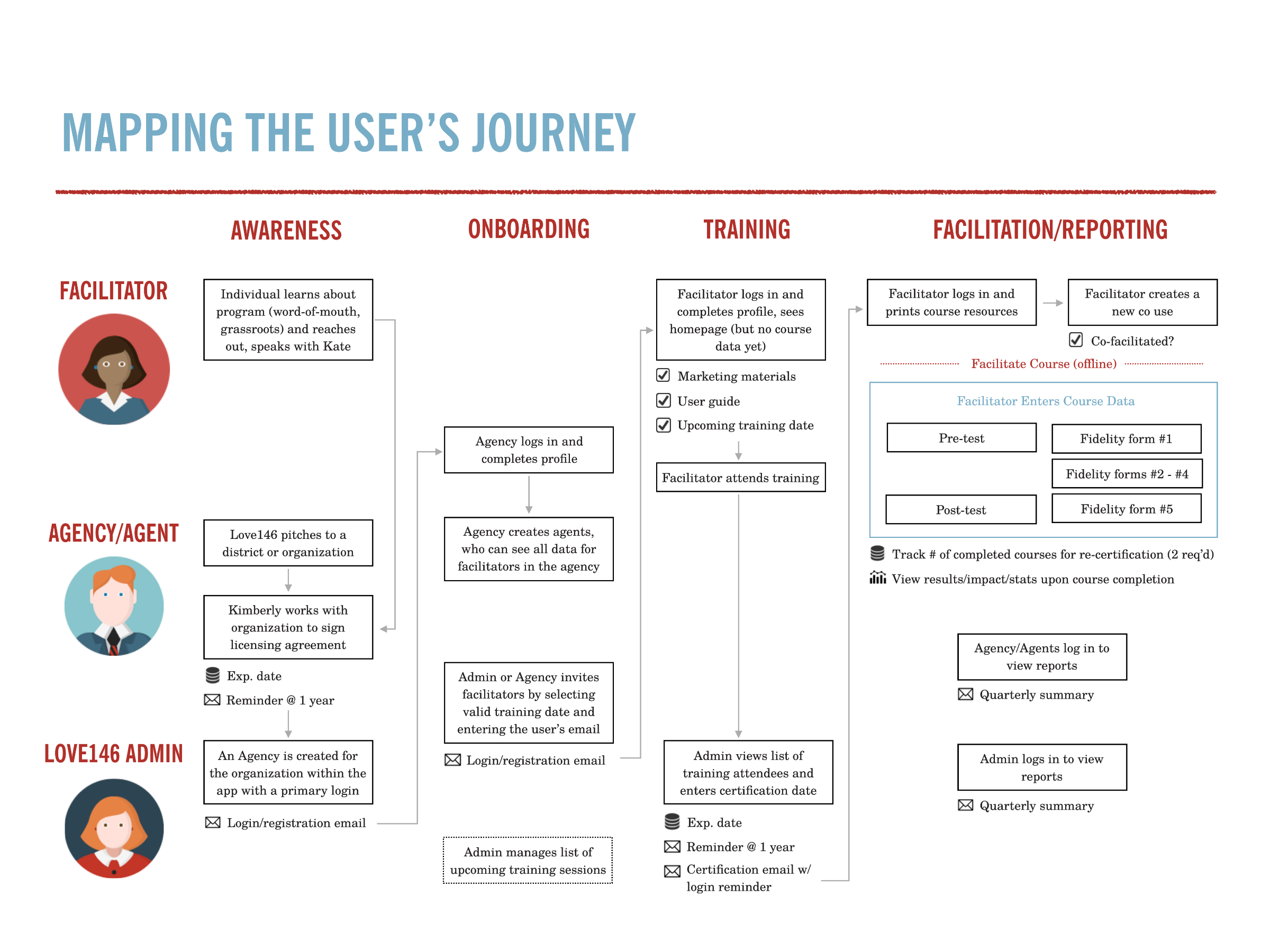
Fig 2.0 — The service map I built from the workshop: three roles down the side, four phases across, from first contact to re-certification. The blue box in the last column is the whole design problem — everything inside it happens with the app closed.
The digital divide killed the iPad
The concept we arrived with assumed a tablet in the room: students tap through the pre-test, data lands in the portal, nobody transcribes anything. Mapping the student experience touchpoint by touchpoint made it clear that assumption excluded the districts the curriculum exists to serve. Under-funded schools, juvenile facilities and community programs don’t have a cart of iPads, and the ones that do can’t guarantee a network.
So we designed for paper, and made the portal meet it. Facilitators teach and assess exactly as they do now; the portal accepts photographed or scanned assessments, runs handwriting through OCR, and then — the part that mattered most — hands every extracted field back to the facilitator in a verification UI built for fast confirmation and correction. Nothing enters the dataset unconfirmed. For research about exploited children submitted to funders, “probably right” isn’t a standard, so the design treats OCR as a first draft and the human as the source of truth.
Designing it, then building it
On a two-person team the handoff is a conversation with yourself, so I took the front end as well: a style guide and customized Sass build that put the Love146 brand back in charge of Bootstrap, a fully responsive facilitator dashboard, and Chart.js reporting wired to my partner’s Clojure API. Every screen a facilitator touches was designed to survive a phone in a classroom hallway.
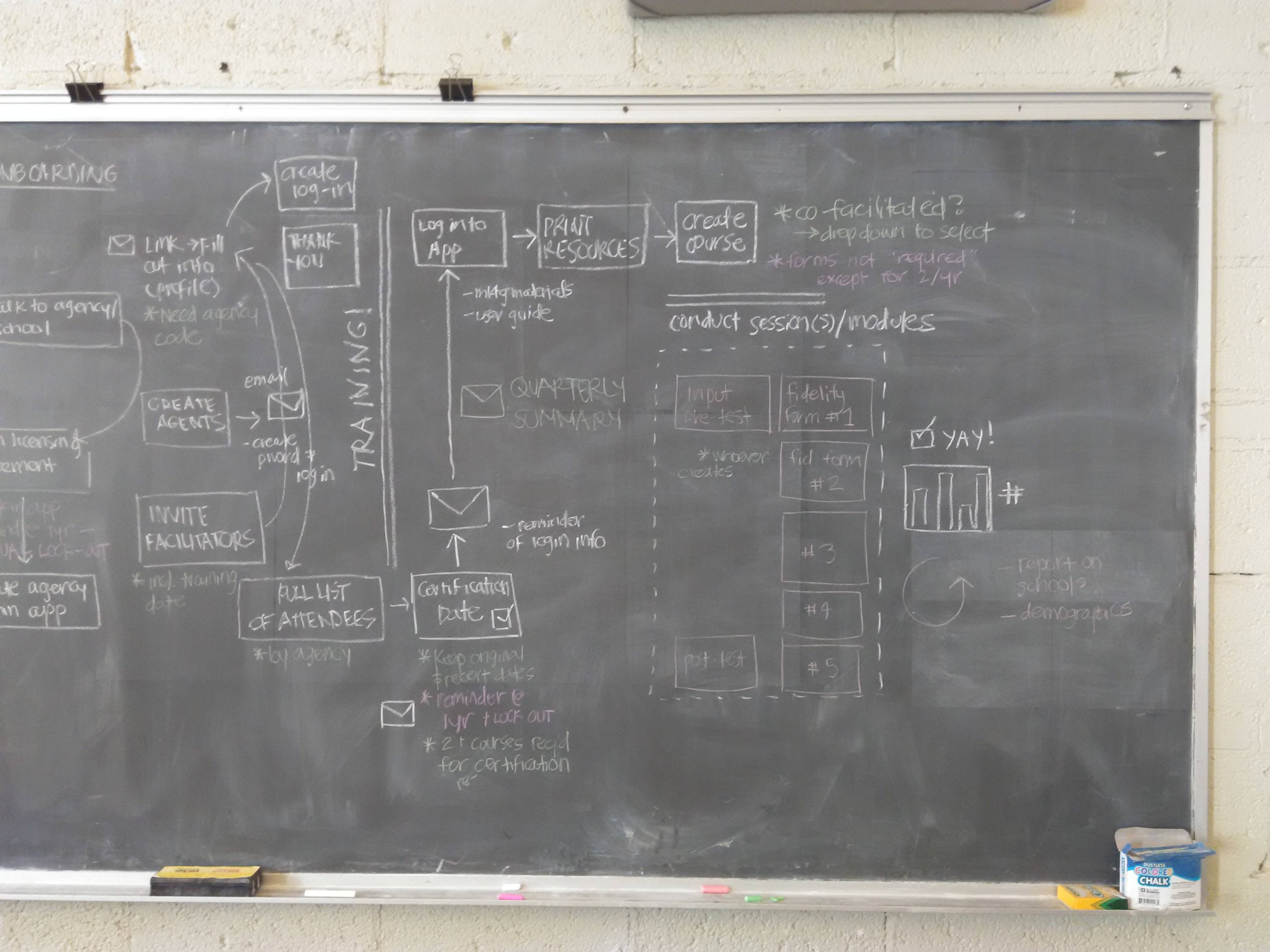
Fig 3.0 — Where Fig 2.0 came from: onboarding, training and the five-form facilitation loop, worked out on the wall in New Haven.
The existence of an app alone put Not a #Number ahead of other programs. It just had to actually work.
— Workshop insights, September 2015
Not a #Number now reaches more than 2,500 youth annually in schools, juvenile facilities and community settings, and the portal I designed and built is still in production and still maintained a decade later — quietly turning classroom paper into the impact data that keeps the program funded.